
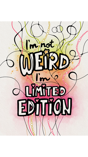
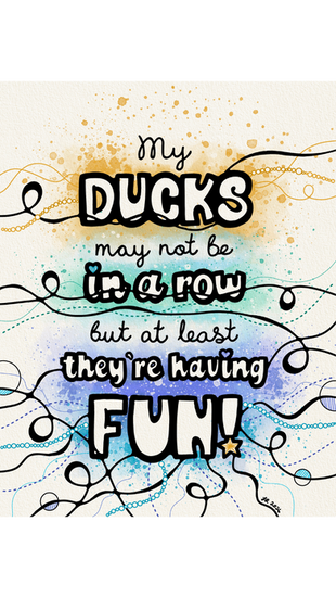
Neurographic Typography: Words You Can Feel
- Feb 8
- 3 min read
Updated: Feb 9
Some words move fast. They skim the surface, get processed by the brain, and disappear.
Neurographic typography is my way of slowing words down so they can land somewhere deeper.
This body of work sits at the intersection of language, emotion, and nervous system regulation. It blends neurographic linework with typography, creating pieces that are meant to be felt, not just read.

Why Words Need a Body
We see thousands of words every day. Most of them never make it past the mind.
But certain phrases linger. They echo. They tighten the chest or soften the shoulders. Those are the words I’m interested in.
Neurographic typography gives words a physical form. The lines respond to the letters. The shapes follow the emotion. The piece becomes a place where meaning can settle instead of rush past.
This is not about decoration. It’s about integration.
The Neurographic Process
Neurographic art is rooted in the idea that line and shape can influence how the nervous system responds. Curved, connected lines signal safety. Repetition creates rhythm. Flow replaces rigidity.
When I combine this with typography, something interesting happens.
The words stop being abstract. They become embodied.
Each piece begins with a phrase that already carries emotional charge. Humor, truth, discomfort, reassurance. From there, the linework develops intuitively, responding to the energy of the words rather than a pre-planned design.
No two pieces are the same because no two moments are the same.
Humor, Honesty, and Regulation
Not all regulation has to be serious.
Many of these pieces lean into humor, sarcasm, or cultural references. That’s intentional. Laughter is a powerful regulating force. Familiar phrases lower defenses and play creates access.


Other pieces are quieter. Heavier. They sit with discomfort or complexity without trying to fix it.
Both approaches matter.
This practice makes space for the full range of human experience, from joy to overwhelm to the messy in-between.

When the Background Changes
Some of the newest pieces shift into darker, reversed backgrounds. This isn’t an aesthetic decision alone. It marks a deepening of the practice.
Light backgrounds invite ease. Dark backgrounds ask for honesty. The words don’t change, but how they’re held does. The layers become more visible. The weight becomes more apparent.
It’s a reminder that growth doesn’t always look bright. Sometimes it looks grounded.
What This Art Is (and Isn’t)
This is not affirmation art designed to bypass reality.
It’s not about positive thinking or fixing emotions.
It is about noticing. It is about giving language somewhere safe to land. It is about honoring the nervous system alongside the mind.
You don’t need to understand neurographica to respond to these pieces. If something resonates, that’s enough.

How to Engage With the Art
You don’t need to analyze it.
Sit with it. Notice your breath. Notice where your eyes rest. Notice what feels familiar or surprising.
Let the words do what they’re going to do.

A Living Practice
This series is ongoing.
The phrases evolve. The palettes shift. The linework deepens.
Each piece reflects a moment in time, both personally and collectively. Together, they tell the story of a practice that’s becoming more honest, more embodied, and more trusting of its own voice.
These are words you don’t just read...They’re words you can feel.
If this work resonates...
This neurographic typography practice is ongoing. New pieces are shared regularly on my Instagram, and future collections and formats will grow from this body of work over time.
This practice is rooted in slowing down, noticing patterns, and staying connected to what matters. Those same values live inside my larger body of work, including the Drawn to Joy™ collection, where creativity, self-trust, and intentional living meet.
If you’re drawn to this kind of reflection, you may feel at home there too.


Comments